Chanel Misia Giveaway Winner Announced

Thanks to Tara’s generosity, we can announce the lucky winner of a 4ml Chanel Misia mini flacon today.

From all the eligible comments left, random.org helped to determine the one person soon to be scented in Misia.

winner2

The winner is:

Ariane

Congratulations!

Please contact me at olfactoria at gmail dot com with your details.

Thanks to everybody for entering, better luck next time!

Posted in Giveaway | Tagged | 2 Comments

Sydney Opera House Photo Essay By Portia

Hi there Olfactoria’s Travelers,

Portia from Australian Perfume Junkies and Perfume Posse here.

I know many of you have only ever seen our Sydney Opera House on Postcards or the TV. It’s one of my favourite places to go hang, not only do they have Opera, Ballet and Theatre but it has some great eateries and bars and the view is ridiculous. The Harbour Bridge and Sydney CBD are all within walking distance. Also Circular Quay, the Botanic Gardens, Museum of Contemporary Art, NSW Art Gallery and so much more.

On this day I was waiting to go to lunch with some mates in the Sydney Opera House Green Room and I was 10 minutes early so I thought you might like to see how beautiful Sydney looks from the Sydney opera House in high Summer.

What fragrance was I wearing? Rosa sur Reuse by SOIVOHLE.

Enjoy,
Portia xx

Sydney Opera House 2015 1

Sydney Opera House 2015  2

Sydney Opera House 2015  3

Sydney Opera House 2015 4

Sydney Opera House 2015  5

Sydney Opera House 2015  6

Sydney Opera House 2015  7

Sydney Opera House 2015  8

Sydney Opera House 2015  9

Sydney Opera House 2015  10

Posted in By Portia, Travels | Tagged , | 11 Comments

Monday Question – Real Life Vs. Cyberspace: How Do You Keep A Healthy Balance?

Our daily social environment has changed so fundamentally in the past twenty years, it is bound to have an impact on us. Work has become easier in many respects, but constant reachability is a definite con. Relationships often start in cyberspace because it is easy to find like-minded individuals, while we hardly dare to talk to a stranger on the streets anymore. The world becomes smaller, everything is within reach, but at the same time we are more isolated than ever. Even the way our brains are wired is changing as studies show.

No doubt there are pros and cons to our new ways of communicating and how to keep the real world and the online world balanced and in perspective is what I’d like to discuss with you today.

How does the online world impact your life?

Do you ever feel overwhelmed by the demands of social media?

Do you find yourself wasting time in front of the computer instead of spending it with real people?

What do you think is a good balance between real and virtual experiences?

Is this ever a problem for you?


My Answer:

I love the options and possibilities the internet provides. I love interacting with you via the blog, I love that I can research just about anything that ever comes up on the internet in minutes, I love online shopping options and virtually travelling to and exploring other worlds at the speed of my fibre optic cable.

I also feel that I have to protect myself to a degree. Not falling into a bottomless hole that is the online world is something I am very conscious of.

I have withdrawn from Facebook, Twitter etc. aside from the automated posts of my blog, because I feel the need to keep my life to myself and not know everything about everyone else either. I think it is all too easy to overload on (unnecessary) information and missing important things in the meantime.

The internet is extremely seductive and knowing myself, I know that to keep a good distance is healthy and important for me. Social media itself is not the problem, but how you use it, how seriously you take it, is of the essence. It can be destructive or life-enhancing.

I wouldn’t want to miss its obvious pros of course, but for the sake of the argument, if pressed for a decision – also thinking about my children – I think I would opt to go back to life before instant and incessant communication.

What about you?


Posted in Monday Question | Tagged , , | 38 Comments

Dip Dye! – A Vat Of Colour Makes A Great Thing Even Better: Hermès Carrés Surteint

Welcome to this week’s Hermès scarf post! Today I want to show you something special. Special in the making and special to me, as in “I love it! (even more than regular silk scarves)” 🙂

Dip dye silk is a truly special thing. A completed scarf, silk screen-printed as every other, is after completion dyed all over again in a single vat of colour (hand-stirred!) to give the silk not only a new, more uniform hue, but also a uniquely soft texture.

Dip-dye scarfs, or carrés surteint in French, boast the softest, most delicate, almost velvety silk imaginable. This tactile sensation along with the delicate shading that abolishes stark contrasts, makes these type of scarf my absolute favorite. Nothing feels, ties or looks quite comparable to a dip dye.

Accompany me on a journey of three scarves today.

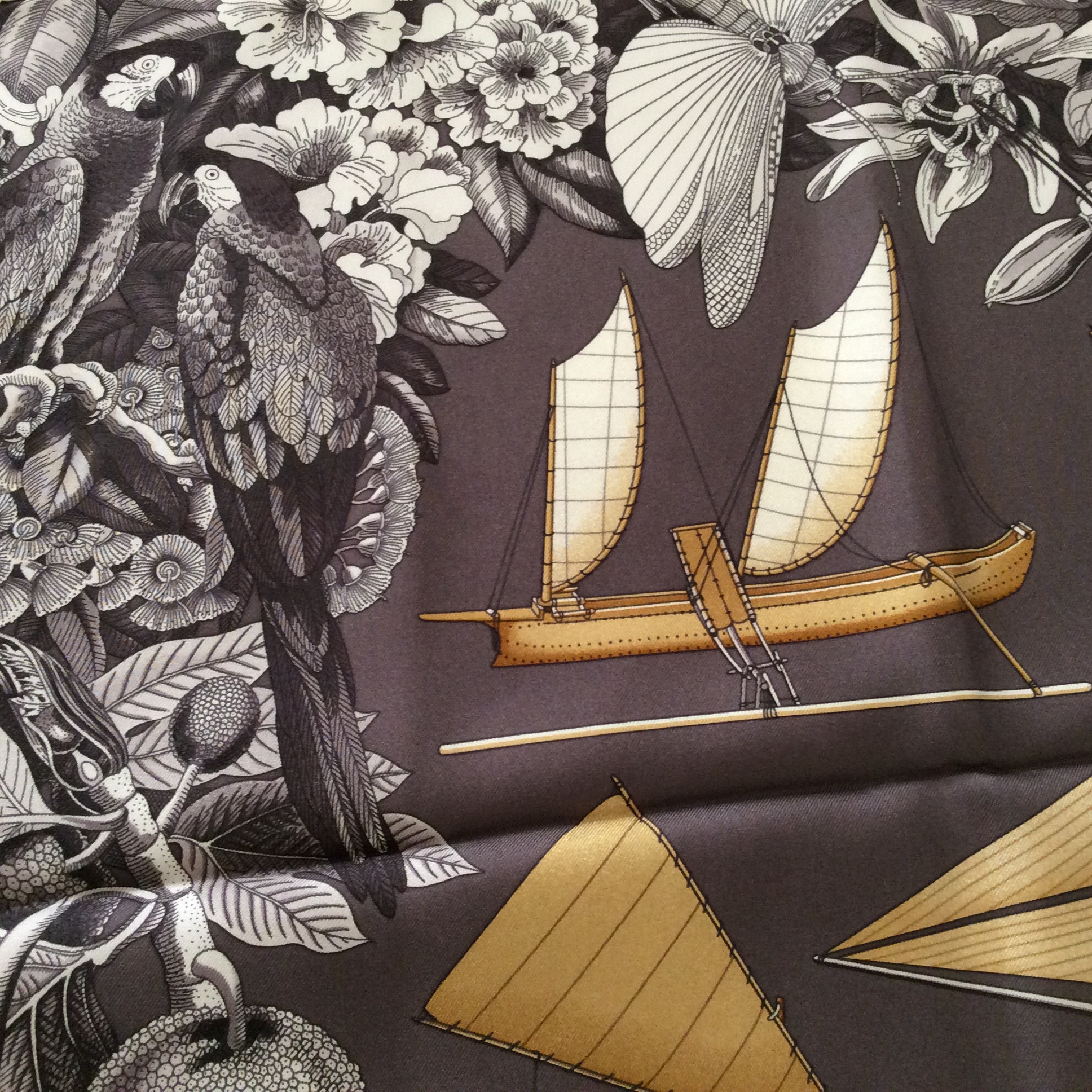
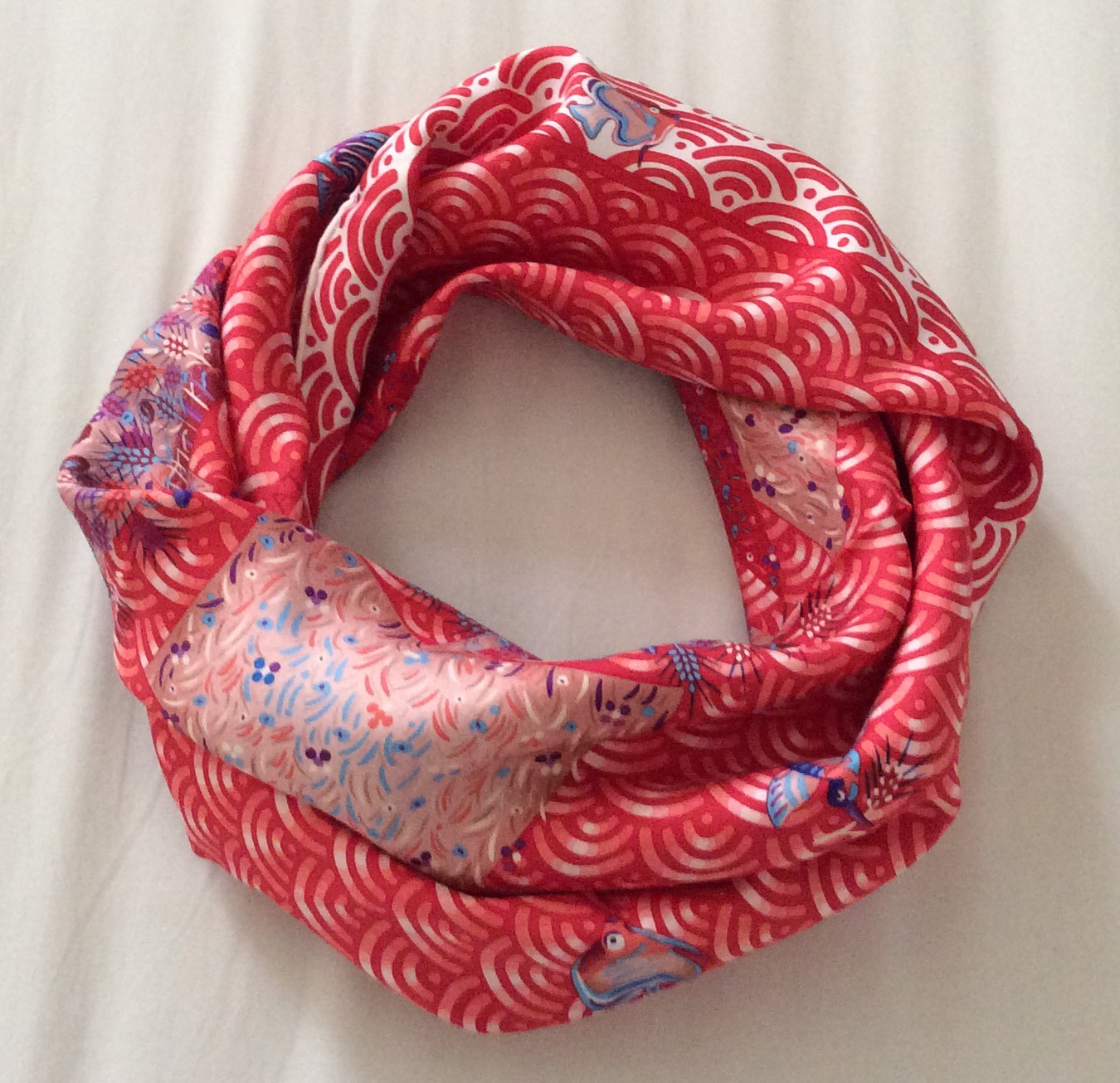
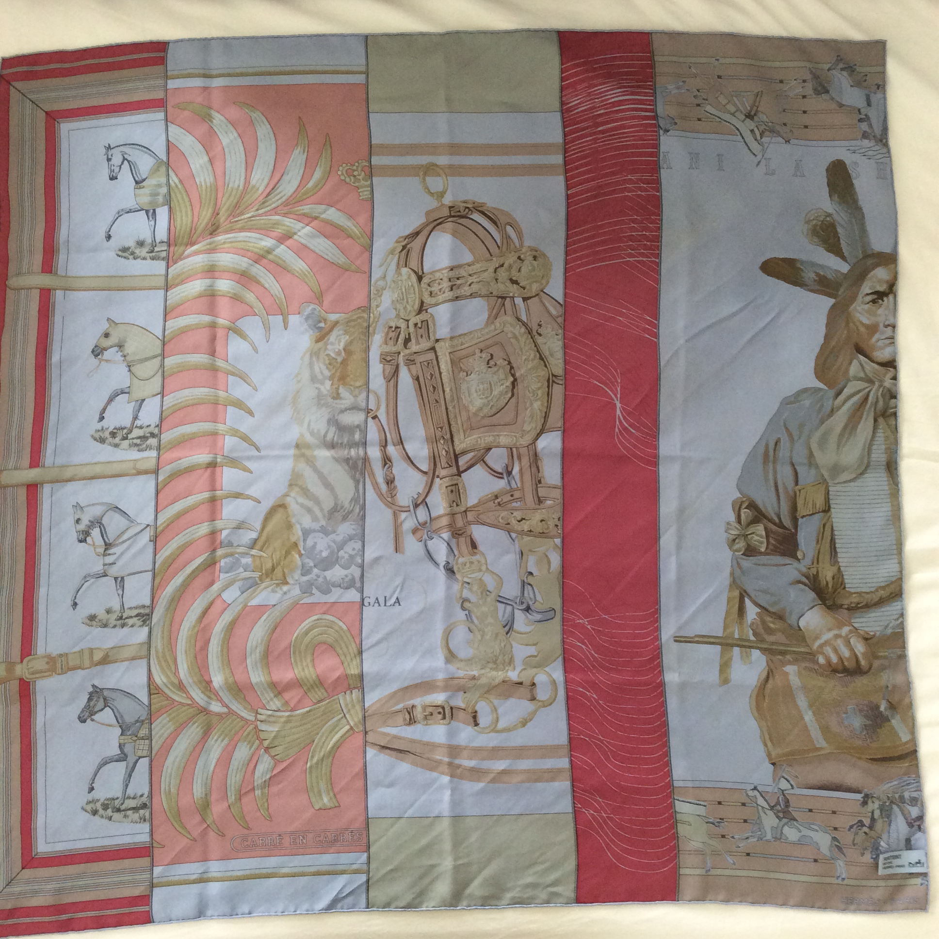
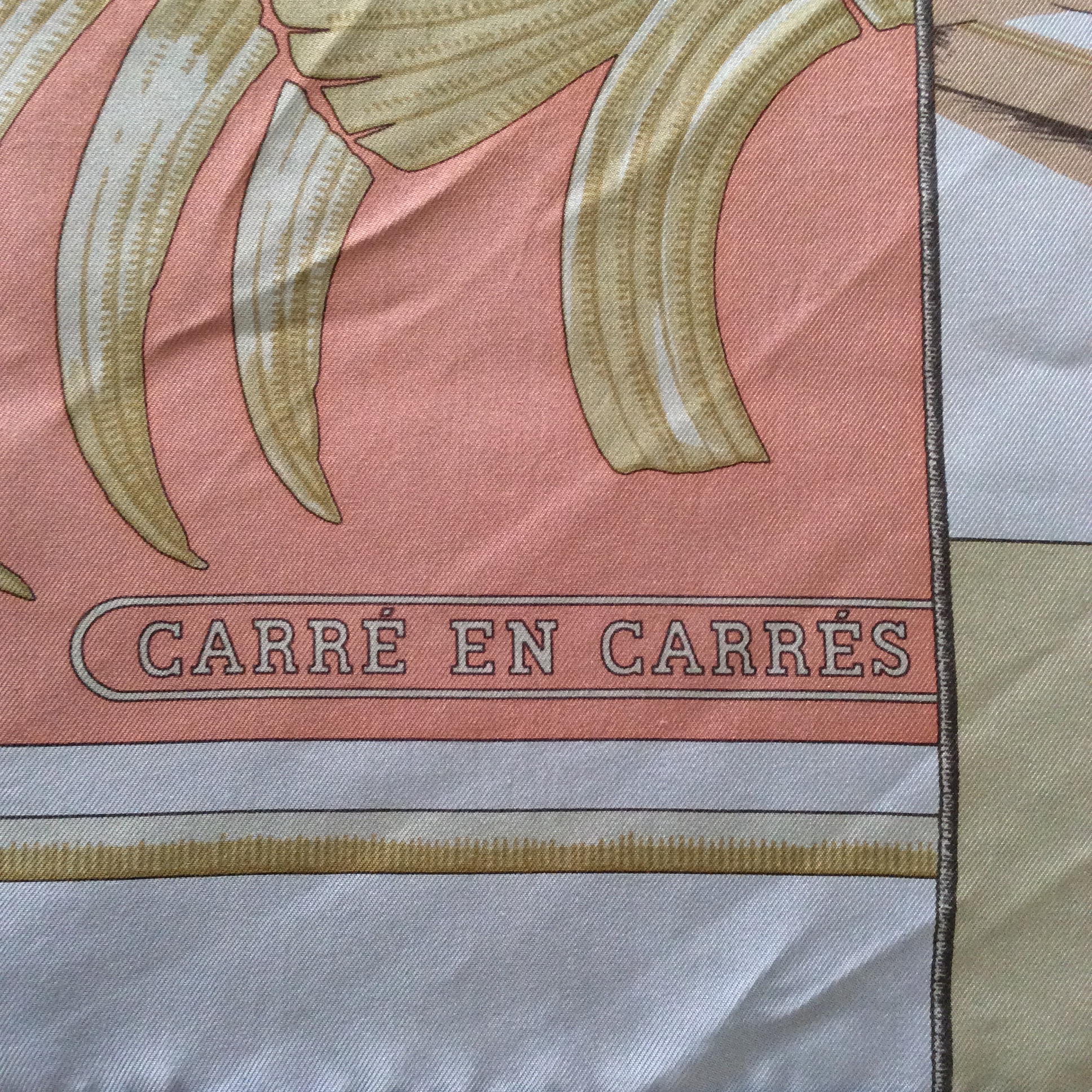
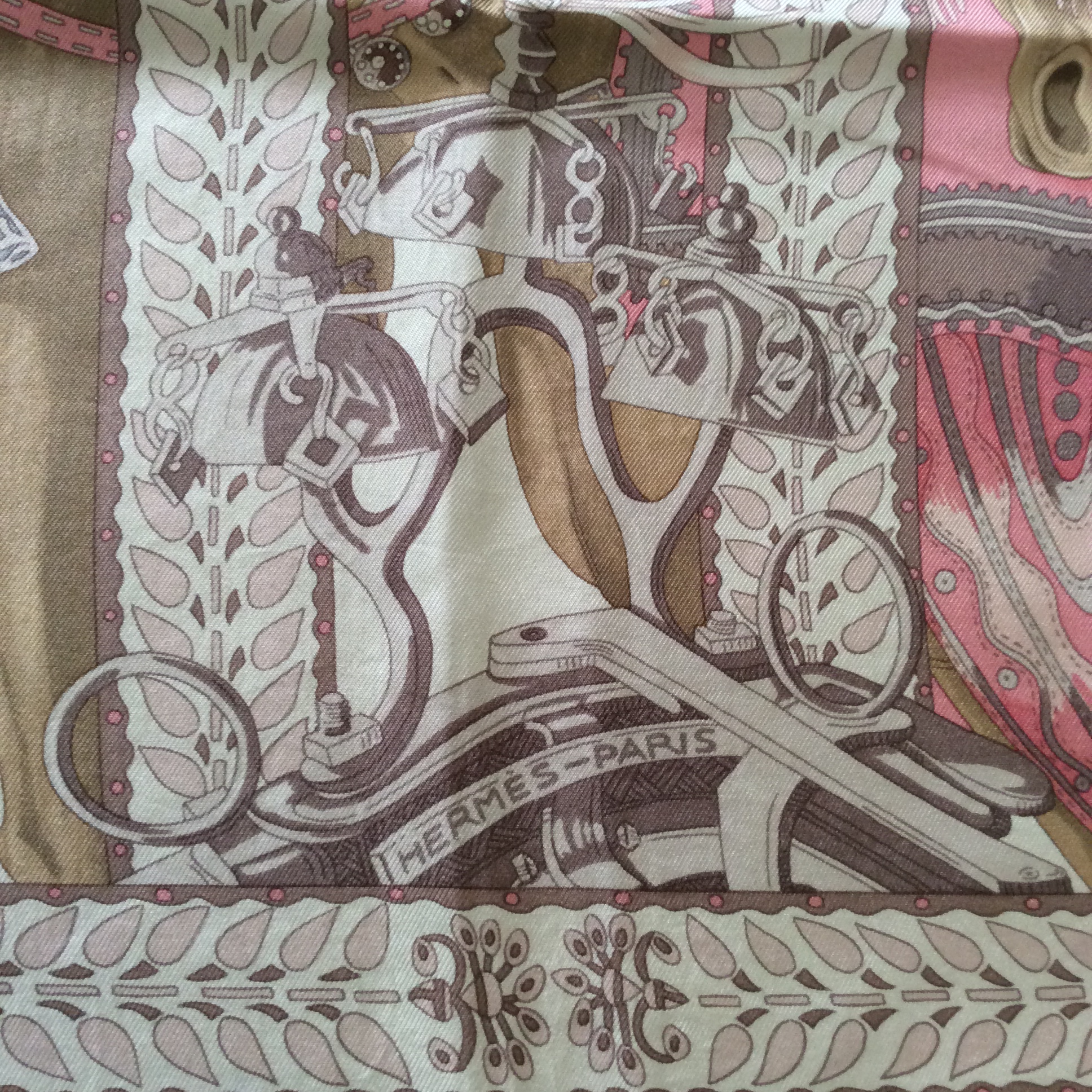
The first one, Carré en Carrés was created by Bali Barrett. You see it here in a dip dye version from 2014. (Please excuse the wrinkles, I love this scarf so much and wear it all the time, so it has not much time to relax.)

photo 1 (23)

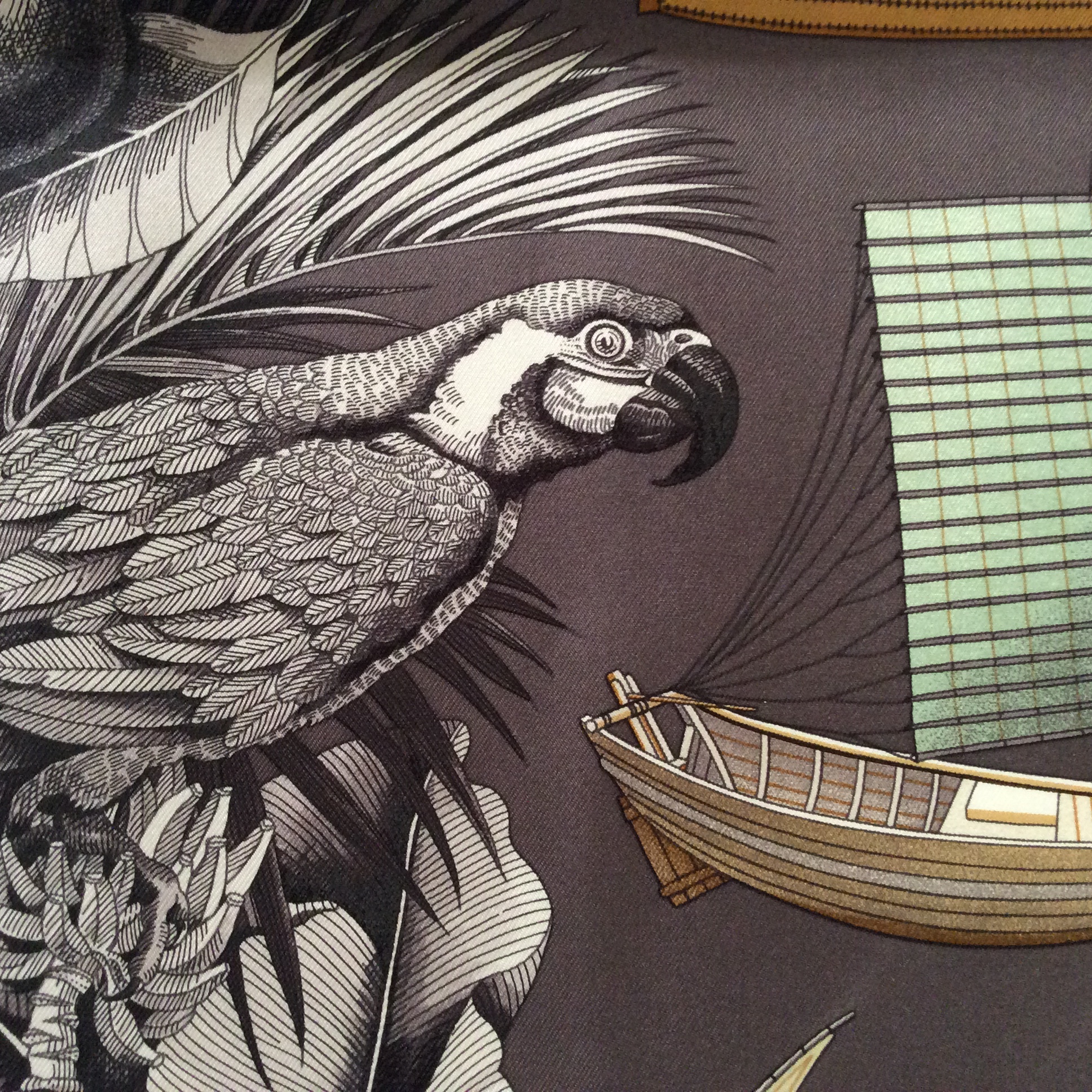
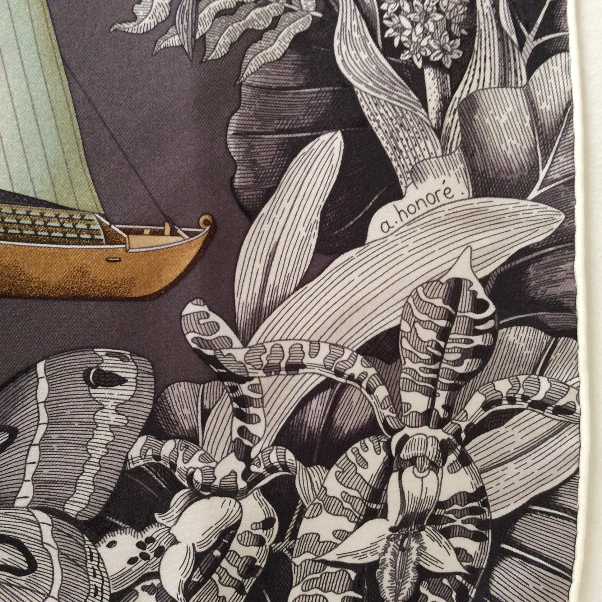
The full scarf comprises of strips of five existing scarf designs, Couvertures et Tenues, Tigre Royal, Brides de Gala, H Cinétique and Pani La Shar Pawnee. It has been released several times in various incarnations, as a 90cm silk carré, a 140cm cashmere shawl, 90 cm dip-dye and as a maxi- twilly.

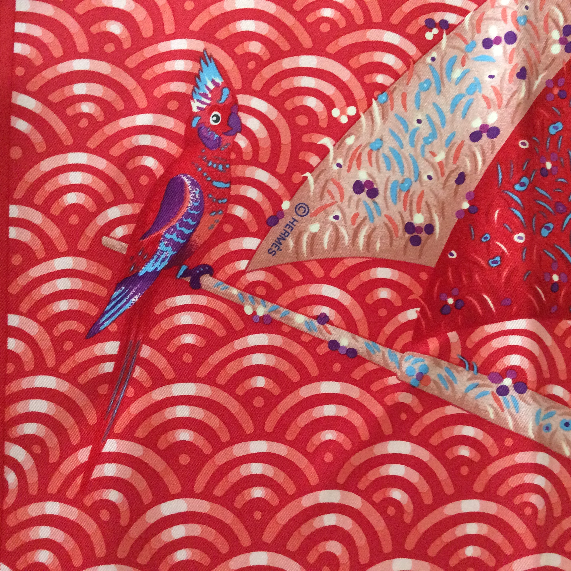
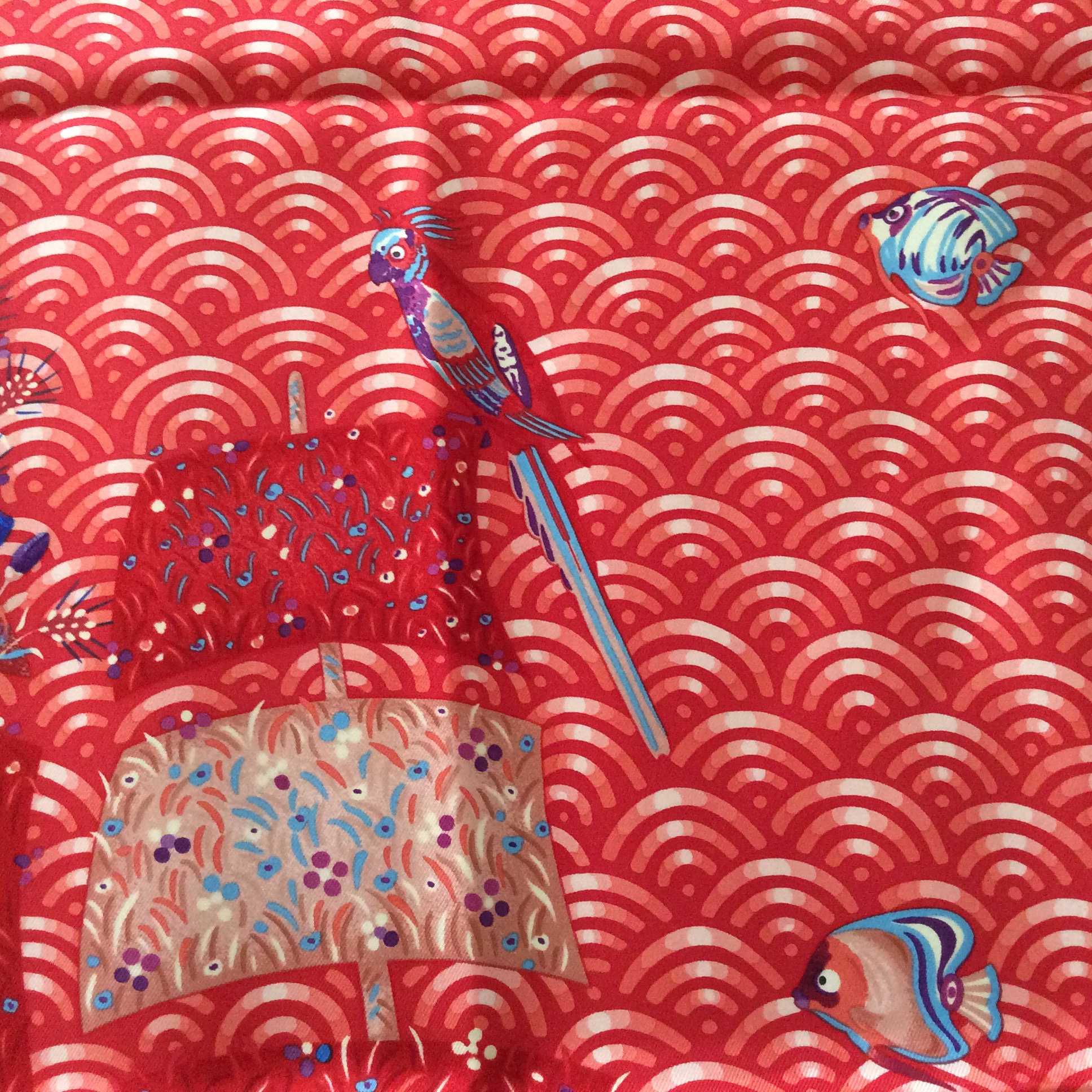
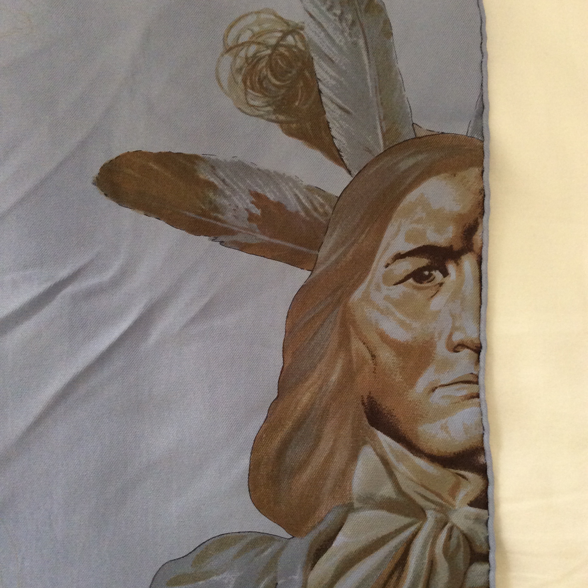
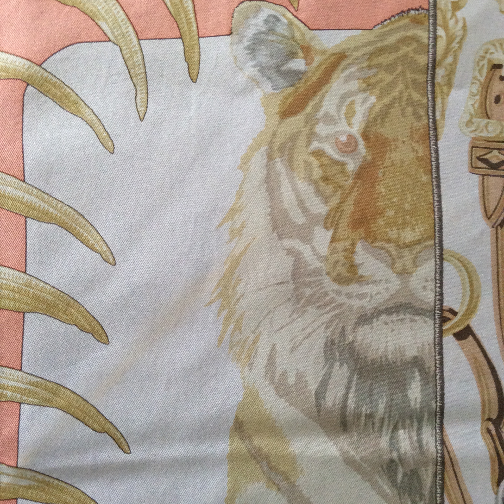
The design acquiesces gracefully to a multitude of metamorphoses. A selection of the house’s most celebrated scarfs are cut into elongated strips, artlessly juxtaposed to create a new motif. Horse blankets and day covers by Jacques Eudel grace the profiles of four horses dressed for relaxation or show. Christiane Vauxelles’s portrait of the Royal Bengal Tiger is every bit as imposing bisected along its central axis as it is whole! Next comes Brides de Gala, essential and unmistakeable at a glance. The rippling lines of H Cinétique lead us to Kermit Oliver’s portrait Pani la Shar Pawnee, showing the First Nation chief whose solemn gaze embodies the ancient wisdom of his people. A quintet of classic scarfs, squared.

-from the Hermès website

photo 2 (25)

Pani La Shar Pawnee looks concerned and sad but regal.

photo 4 (20)

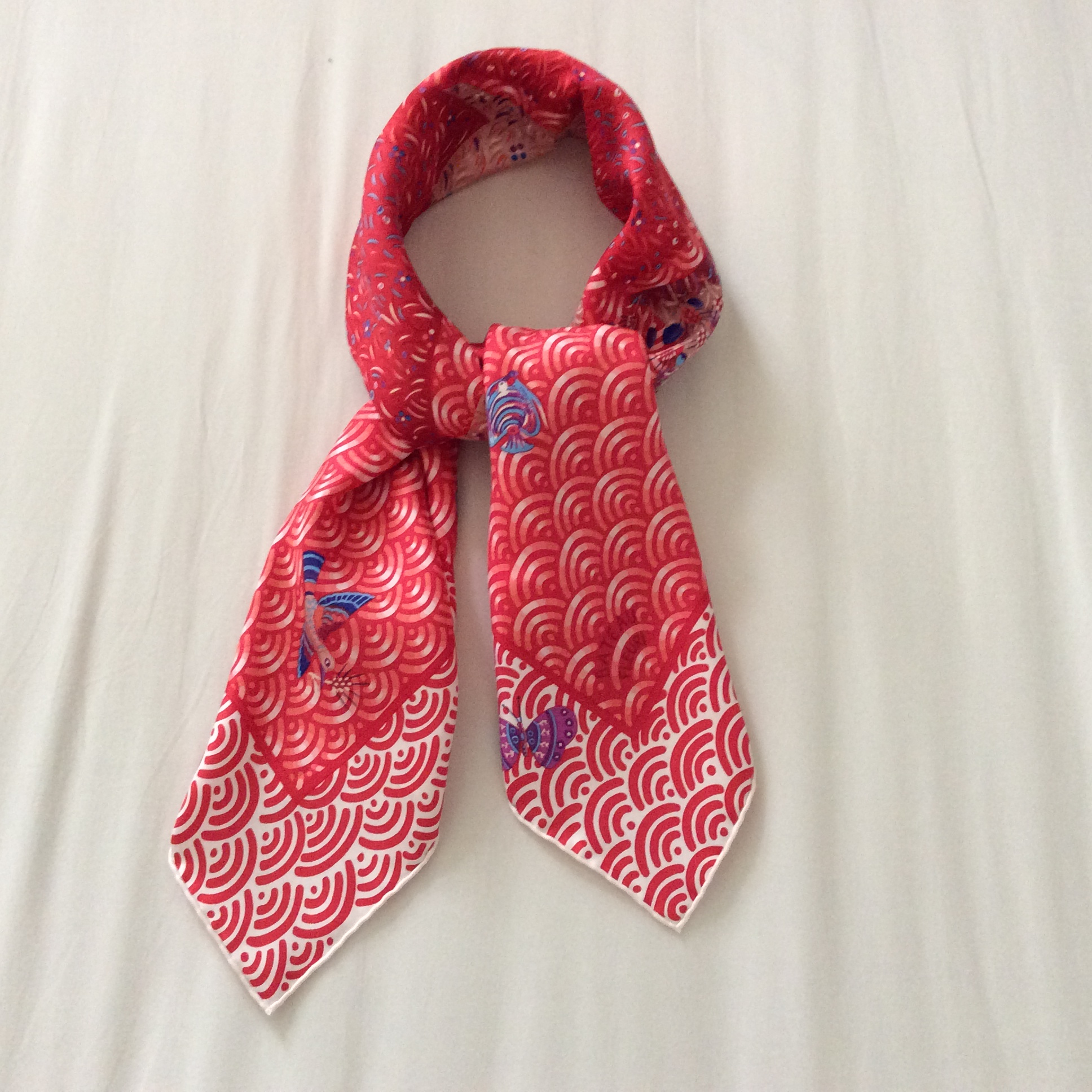
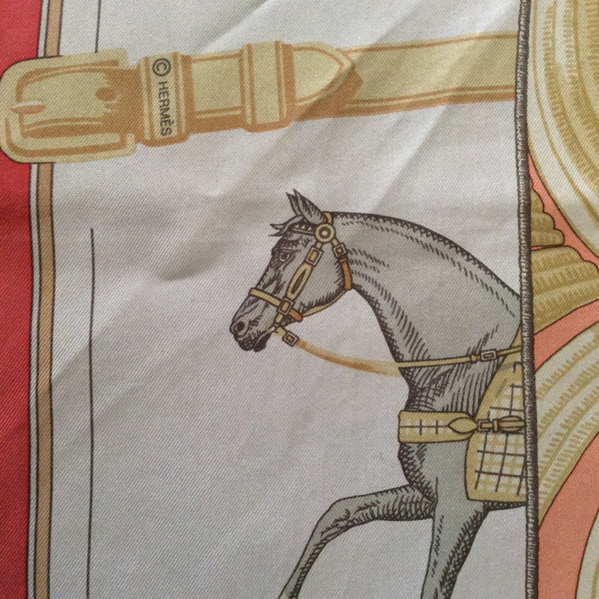
Couvertures et Tenues shows horses decked out in horsey regalia, the striped border of this one makes a particularly attractive corner, when the scarf is folded.

photo 3 (22)

Tigre Royal is a classic design that many of you will recognize. While I wouldn’t go for the full-on tiger myself, I love the half I get of him in this scarf. It makes him less overwhelming and I can enjoy this iconic design when I feel confident enough or hide him in the folds of the scarf.

photo 5 (16)

Here is the title, close-up.

I think this is an ingenious scarf, as it allows you also to fold it along the strips which makes five scarves in one. When folded along the bias, the design vanishes and you get an abstract scarf that mainly impresses with its gorgeous colour.

photo 1 (24)

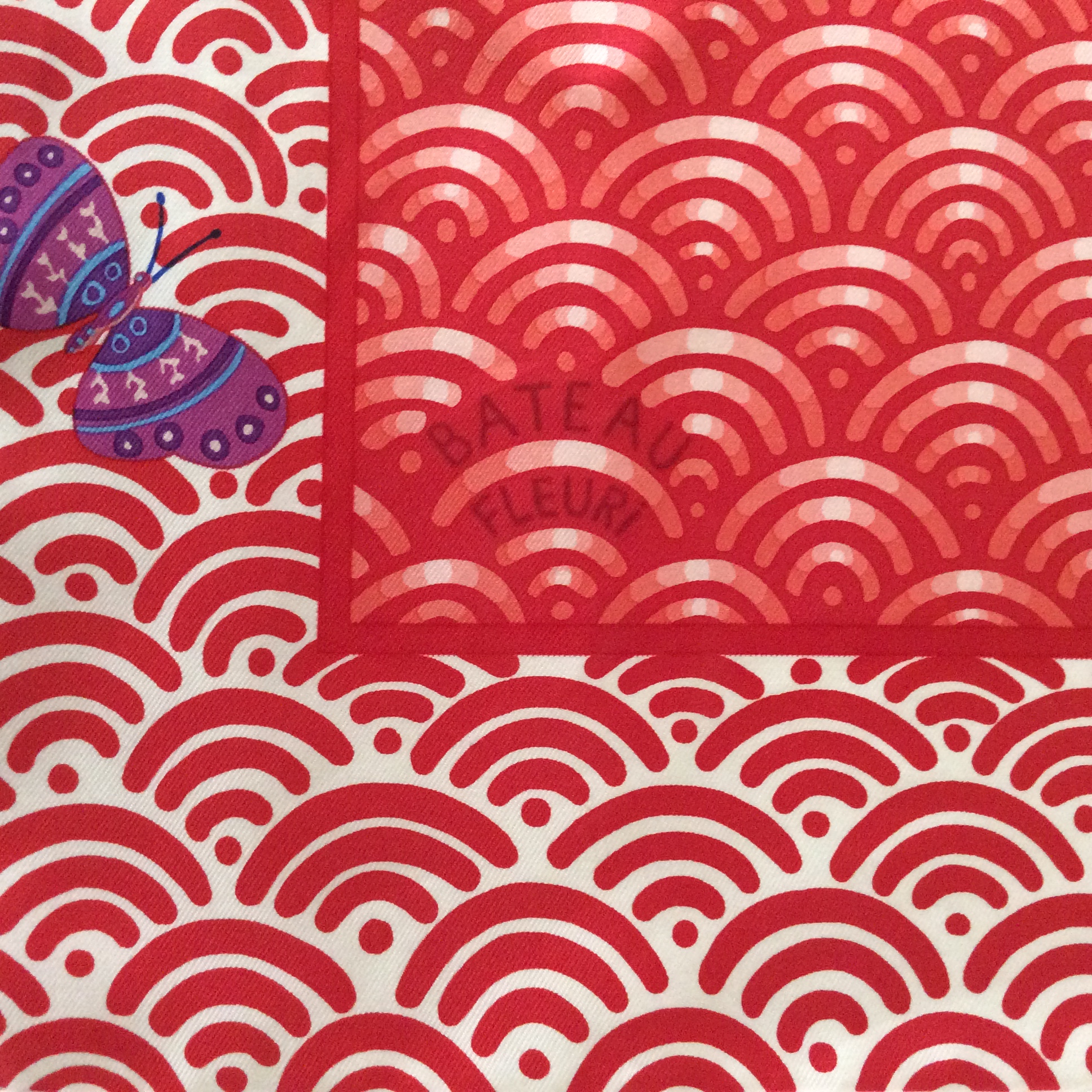
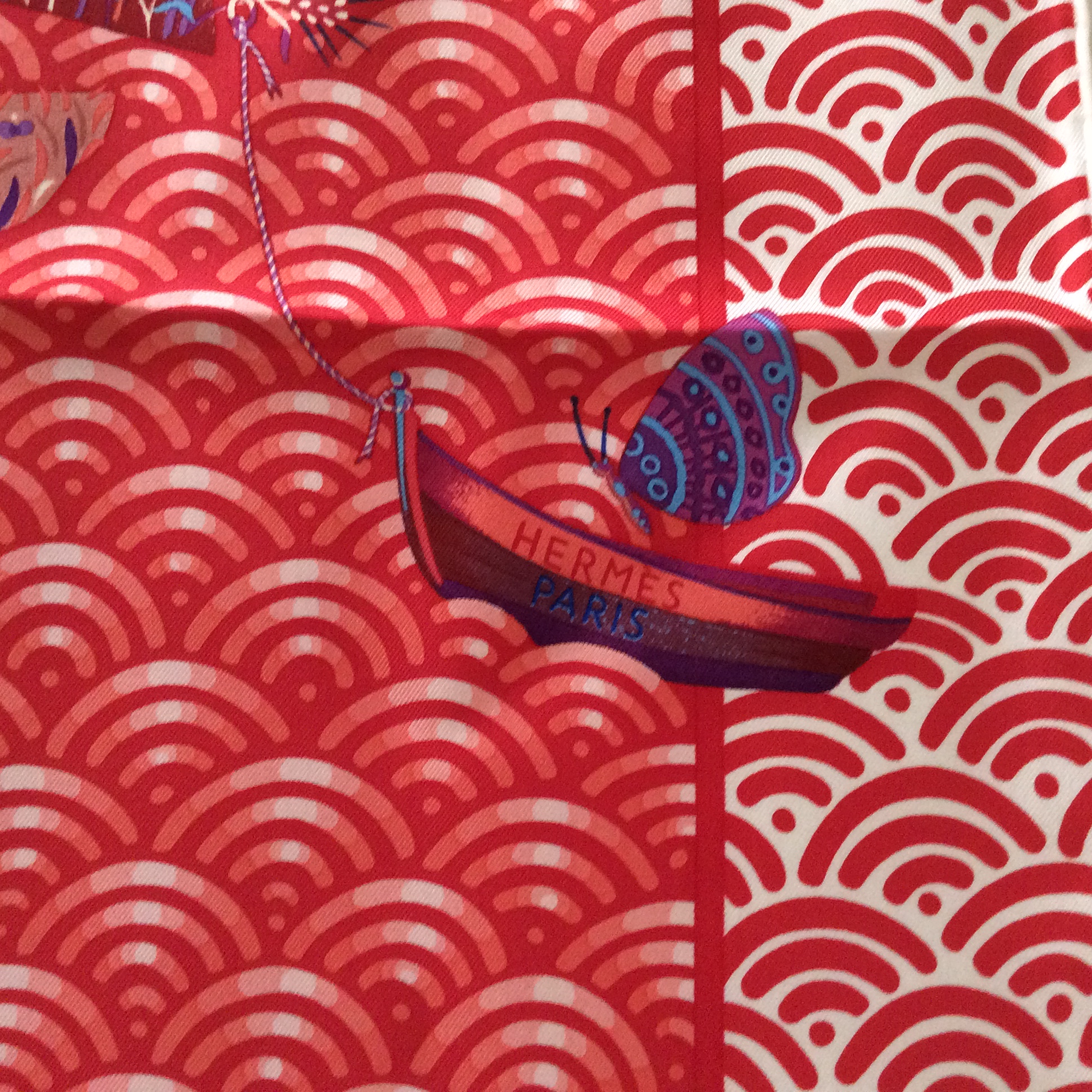
The tag, different from regular ones, is bigger and shows the colour the scarf has been overdyed with. It this case a delicate powder blue with a hint of lilac.

You also see the very different other corner in this picture, it is a very different scene from the Couvertures stripy one on the other side, and therefore makes for a completely different scarf when folded to show off this side.

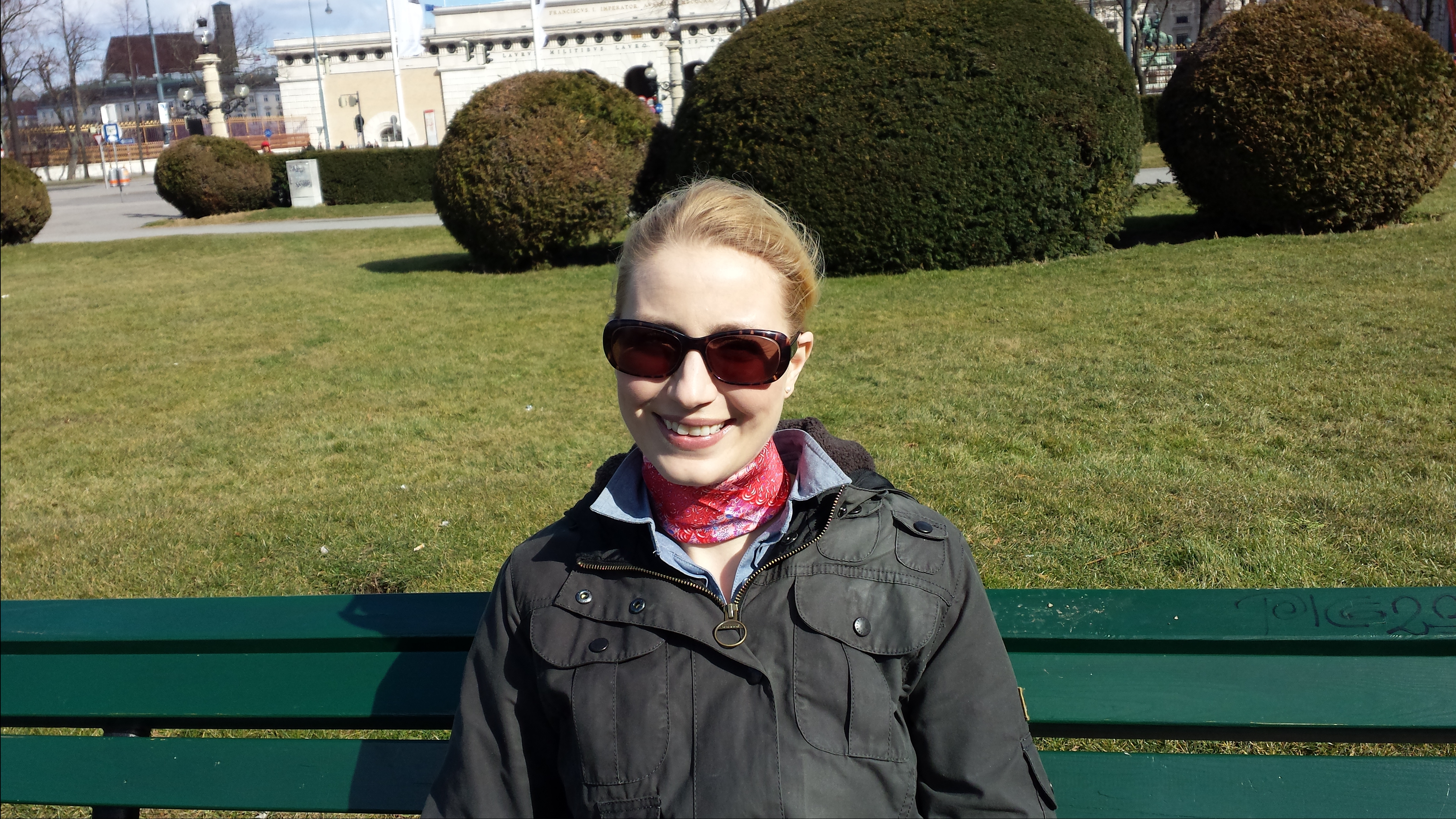
I bought this scarf in Vienna when Val, the Cookie Queen was visiting. The idea was to show her the boutique, not find anything for me, so clearly ideal buying circumstances. 😉

————————————————————————-

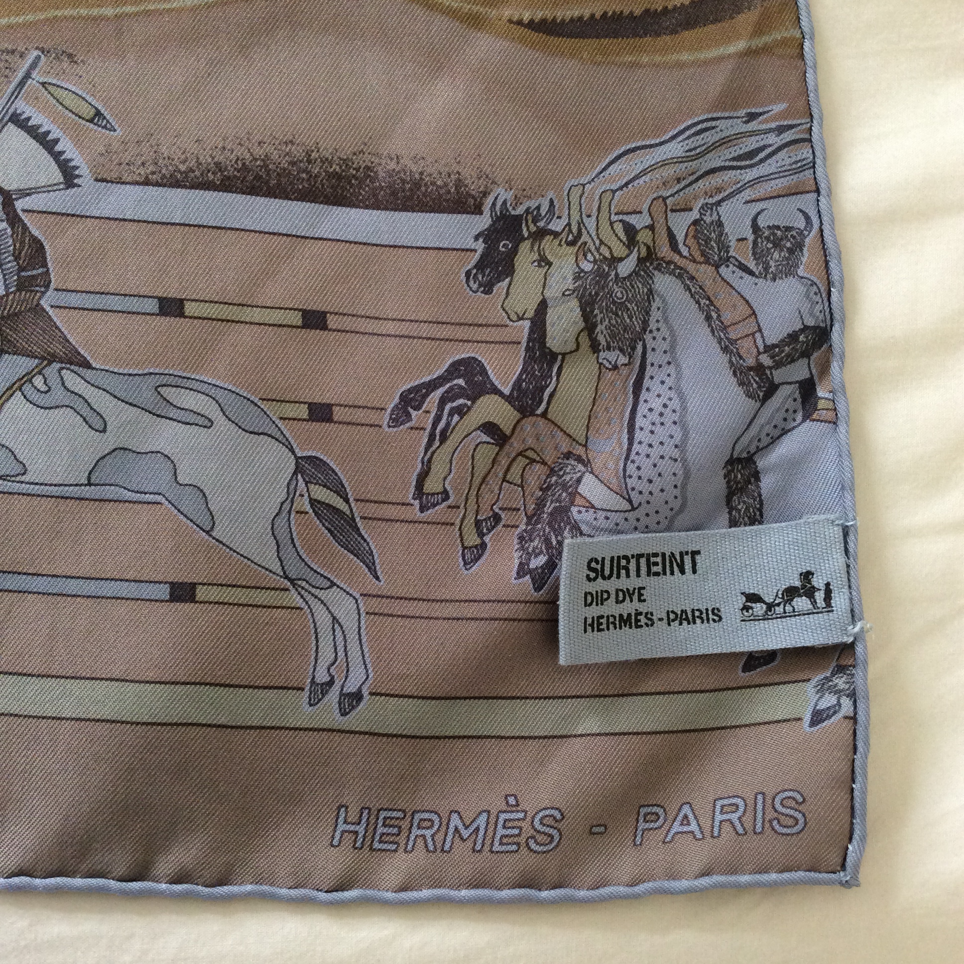
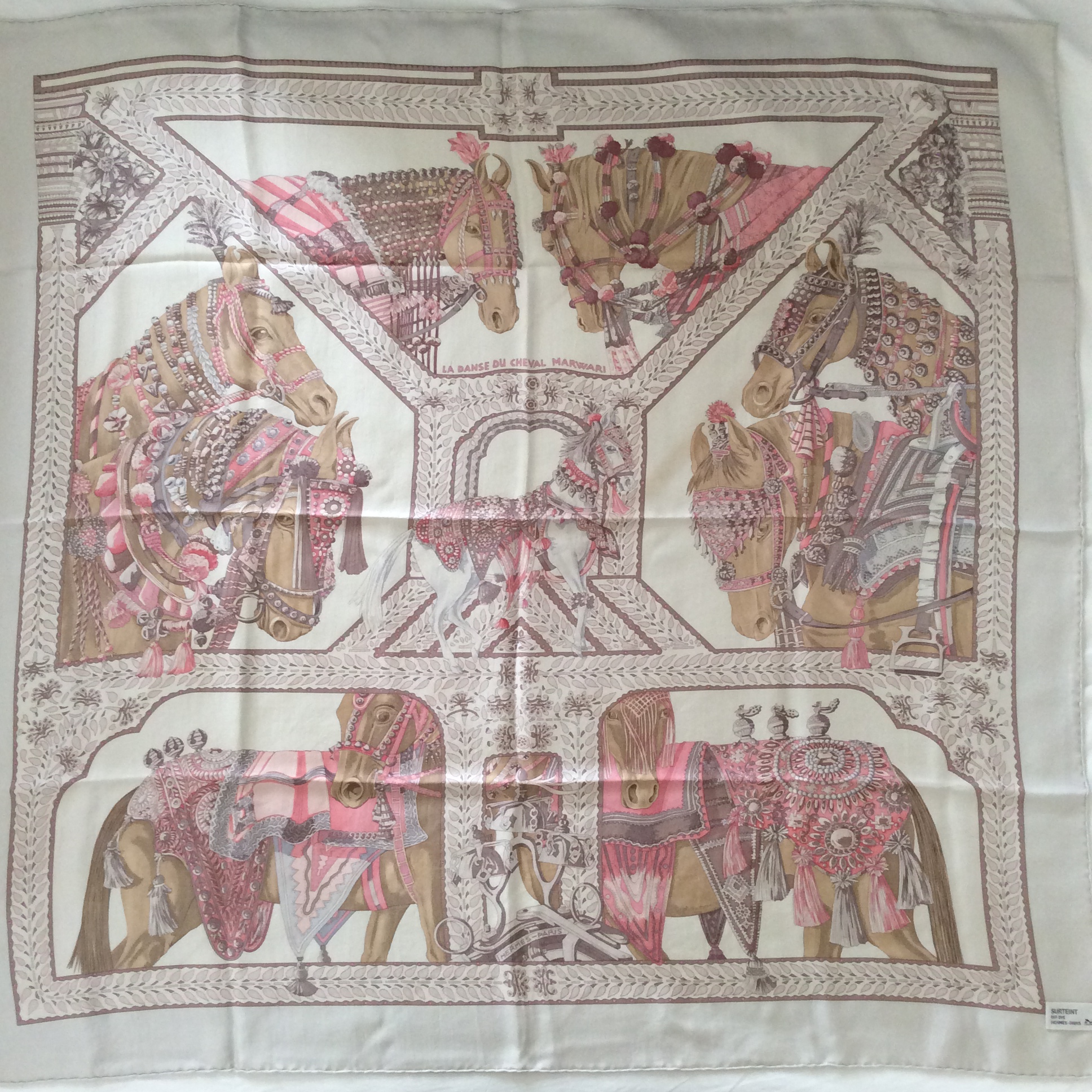
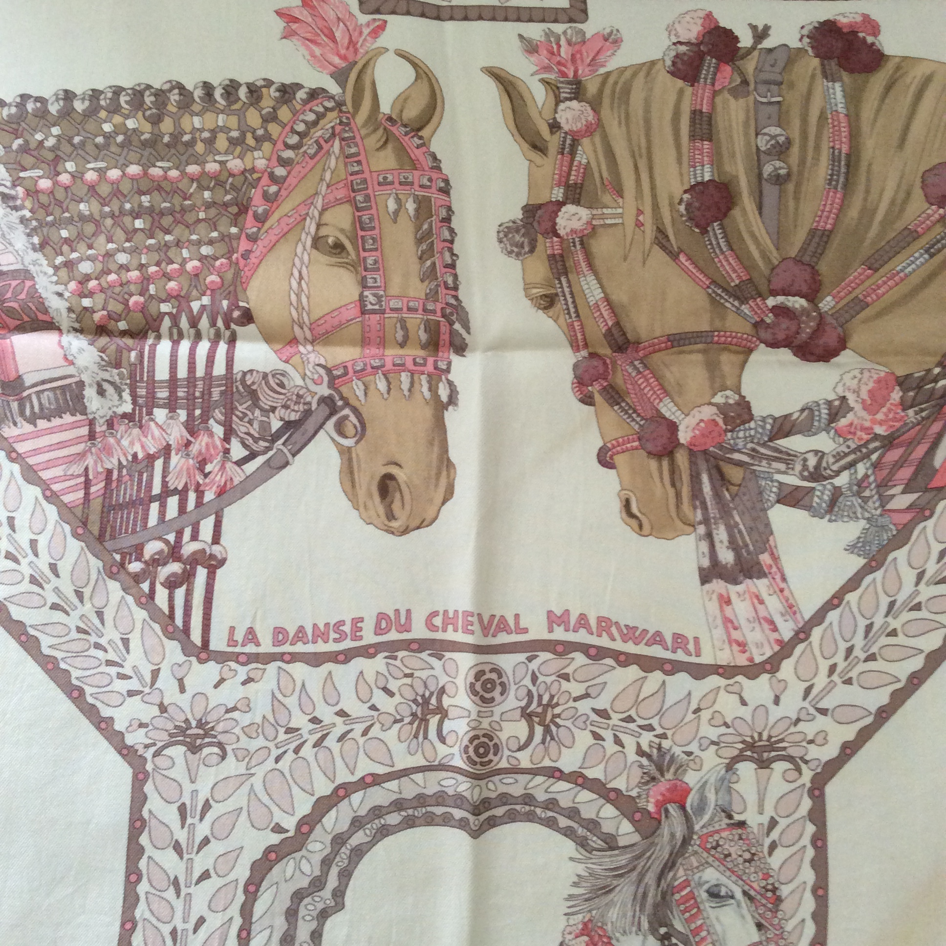
La Danse de Cheval Marwari , the second dip-dye scarf today, was designed by Annie Faivre and first released in 2008. Here you see my Cheval in dip-dye from 2014.

photo 4 (21)

“The Marwari is the horse of the Rajputs, the first Indo-Aryans. Not only does this caste have historic origins, it also boasts a legendary genealogy according to which the Rajput kings were born of the sun and their horses made of sunbeams. Prince Siddharta, the future Buddha, left his palace on a shimmering white steed. All this symbolism has made the Rajput riders and their Marwaris famous worldwide. In the centre of the scarf DANSE DU CHEVAL MARWARI, stands a beautiful steed. Elegant with graceful, thin legs, the horse’s most salient feature is his ears, the tips of which are turned towards one another in the shape of a crown. The other horses all look at him, waiting for their turn to execute a dressage. They are all sumptuously adorned in jewels and brocades, as precious as those of their riders. This parity signifies the intense relationship between master and animal. Marwaris still take centre stage in parades, bearing finely worked saddles and headpieces, and breastplates adorned with gold necklaces and precious stones.”

– from the Hermès website

photo 2 (26)

Title and center horses (those sad and loyal eyes!).

photo 3 (23)

The shading in this scarf is so delicate and pretty, nothing is stark or bright (this design in bright colours is completely unwearable for me). I was happy Hermès released this particular design in a bunch of soft pastel shades last year, there also was a pink, a blue, a green and a grenadine coloured one (the latter not exactly soft and pastelly, but I mention it because it must be stunning on the right person).

Having missed out on the design in 2008 when it came out the first time around, I pounced on this one right away and had to physically restrain myself not to add the pink or light blue one as well. But I picked right, I’m happy with this version.

———————————————————————————————-

The third and last scarf is a classic in a new interpretation.

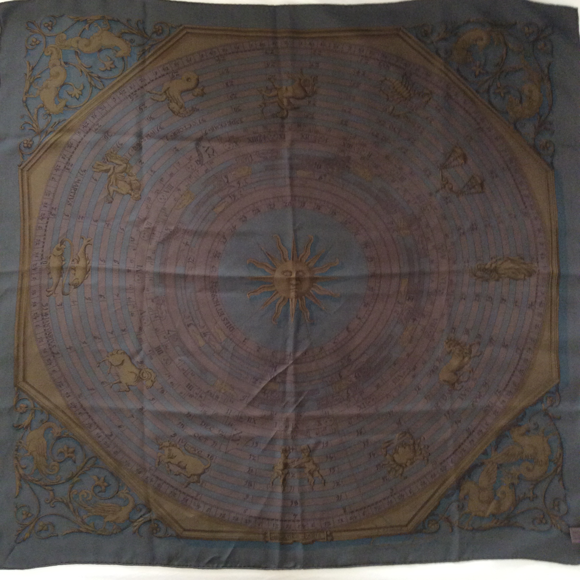
Astrologie was designed by Francoise Faconnet in 1963. It has since been released several times in different iterations, my dip-dye is from the latest batch offered in 2010.

photo 5 (17)

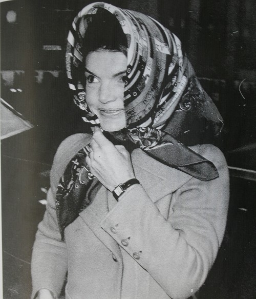
It is a design made famous by Jackie Kennedy, who loved her Astrologie (so does Oprah, btw, as I found out when researching this post).

astrologie-jackie


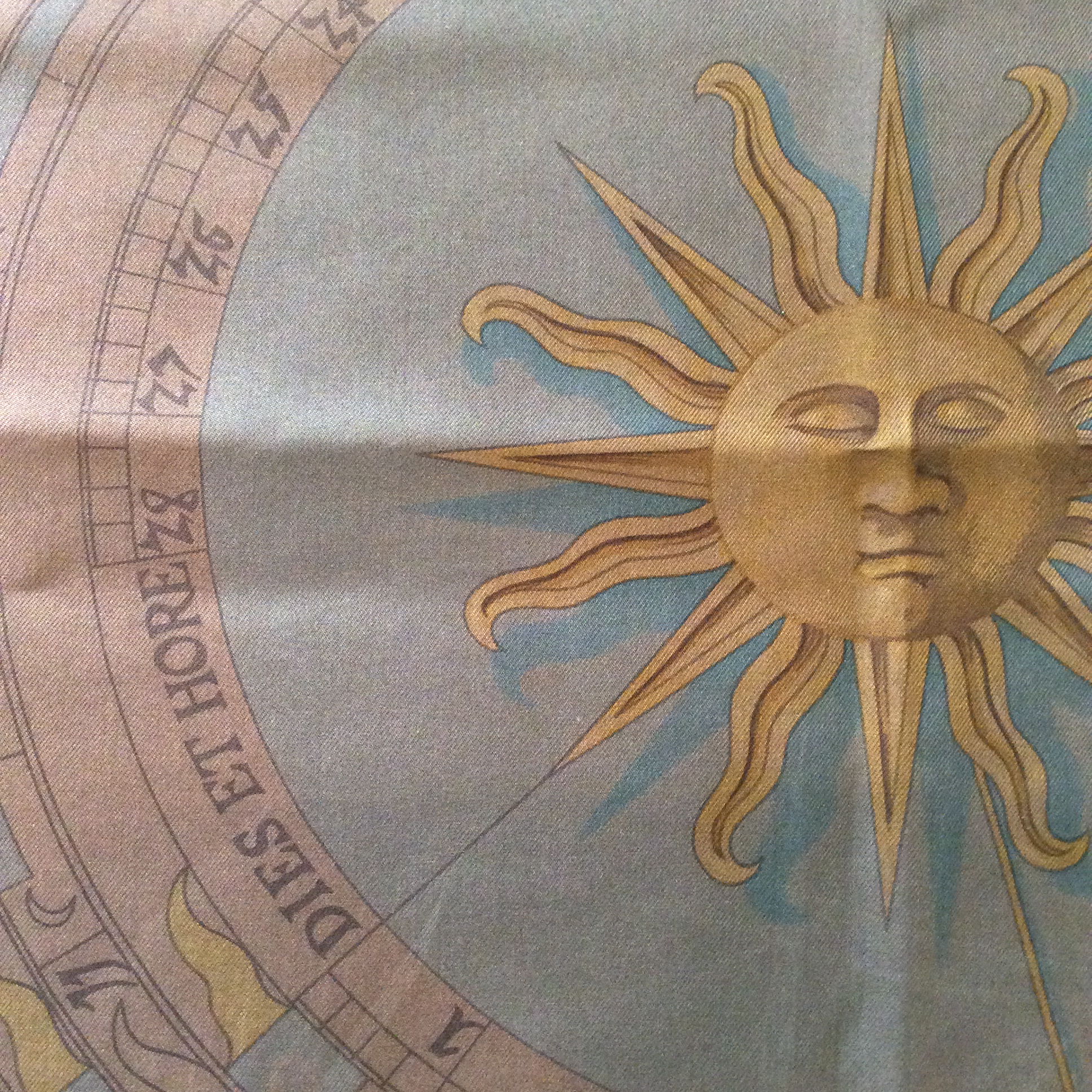
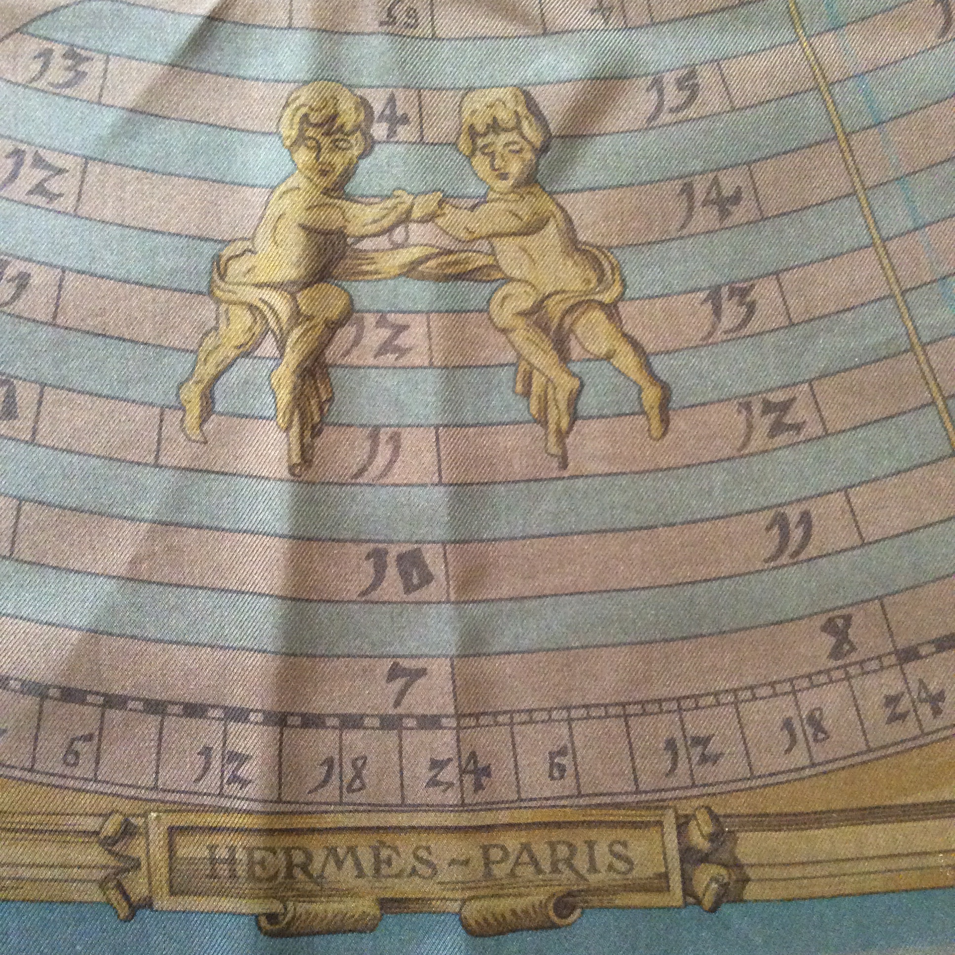
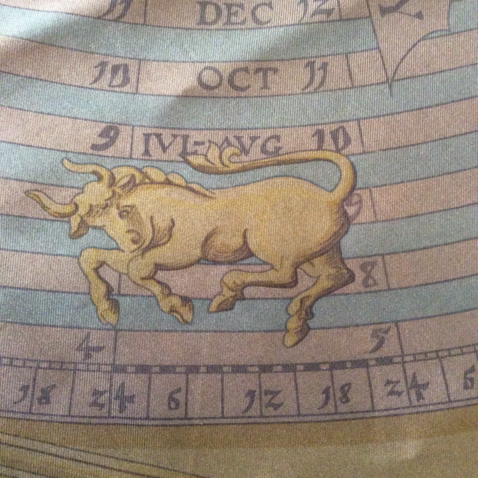
Astrologie shows a sun in the center and the twelve star signs in a circle around it.

photo 1 (25)

The latin inscription on the scarf, Dies et Hore, is often mistaken as the title of Astrologie, it is not, but it bears to keep this in mind should you ever look for this scarf, as many re-sellers call it by this wrong name.

photo 3 (24)

Gemini and the Hermès signature at the bottom.

photo 4 (22)

Taurus, my star sign is already reigning these days, so my birthday is not far away. (Should I publicly weep and wail? It is not just any birthday that’s coming up… sigh.)

photo 2 (27)

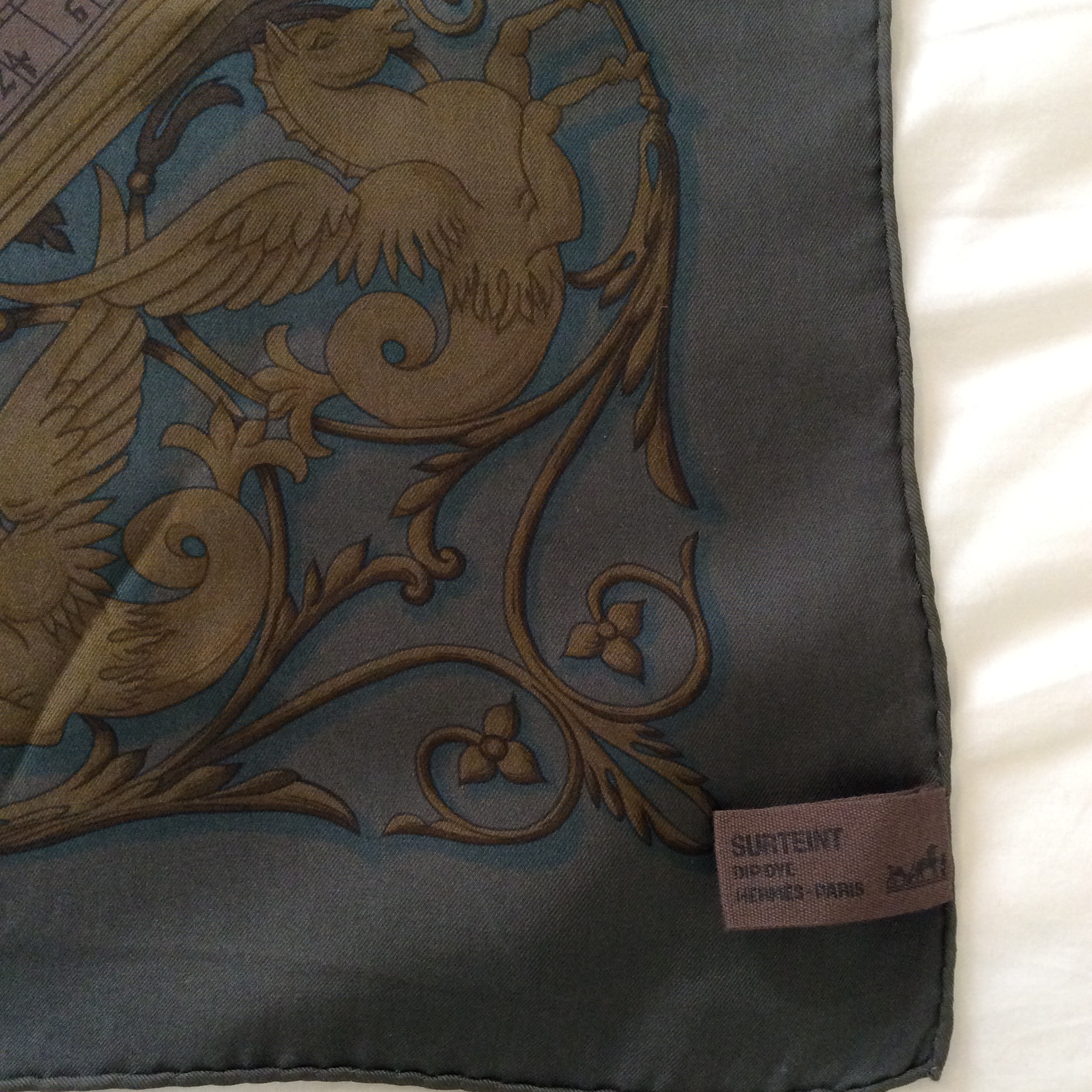
The tag showing the colour the scarf was dipped in, a muted brown.

Astrologie is my quintessential fall scarf, it works well with falling foliage. 🙂 So it probably stays in its drawer until October…


This concludes todays post, as always, thanks so much for reading, see you in the comment section!

Are you familiar with the dip-dye scarves? What do you think of them?

Posted in Hermès, Scarf Collection, Scarves | Tagged , , , , , | 37 Comments

Chanel Misia and A Visit To The Harrods Salon de Parfums – Plus A Giveaway!

By Tara

Last Autumn Harrods opened their luxurious Salon de Parfums on the sixth floor. It’s essentially a long row of fragrance boutiques – one for each brand – which highlight their most exclusive collections.

Boutiques[1]

Other high-end lines (such as Cartier’s Les Heures de Parfum) are on shelves dotted the opposite wall. The Roja Dove Haute Parfumerie has moved up here from the Urban Retreat and has the largest space.

Les Exclusifs[1]

On arrival I made a bee-line for Chanel in order to try the new addition to Les Exclusifs: Misia (pronounced Me-sha). All the SAs I spoke to in the Salon de Parfums were extremely helpful and friendly and Sophie at Chanel was no exception. We sat down and she gave me the whole Misia backstory.

chanel[1]

The Parfums de Chanel Boutique


As you may have read by now, Misia Sert was the best friend and confidante of Gabrielle Chanel. They were both born in impoverished circumstances and went on to improve their positions in life exponentially. Misia pulled Gabrielle out of her depression following the death of her great love, Captain Arthur Edward ‘Boy’ Capel. She was a great patron of the arts and was the muse for a number of artists.

Misia takes its inspiration from the aroma of the theatre’s backstage as well as Chanel’s iconic cosmetics. It was composed by Olivier Polge who took over the reins as Chanel’s in-house perfumer from his father, Jacques, on the 1st January this year.

The fragrance features violet, rose, orris, tonka bean, benzoin and a “hint of leather”.

Tray[1]

The Misia Tray

Sophie laid out a tray of items which represent the main facets found in Misia. She gave me a violet crystal to taste (sweet!) and some iris scented face powder to put on my skin. She then passed me a lipstick which is portrayed by the waxy accord in Misia and I sniffed one of their blushers, which are all scented with May rose.

Finally, Sophie put some tonka bean and benzoin on paper strips which are used in Misia to capture the “soft heaviness” of velvet theatre curtains. It was a fun way to be introduced to the perfume.

Me chanel

Tara at Chanel


Misia is pretty much what I had imagined it would be: a lipstick smeared, powdery/creamy cosmetic fragrance with candied violets. It’s incredibly well blended with a refined playfulness about it. I’m sure it will be a winner for them, although Sophie did tell me it tends to polarise people.

If you like cosmetic perfumes I think Misia is a must-try. I would caution that I’ve found it rather quiet and short-lived, so consider giving it a good test-run before purchasing.

Guerlain[1]

A wall of Bee Bottles

Aside from Chanel, I’m a big Guerlain fan so I had to pop into their boutique before I left. Here they had their newly released wedding perfume which is named Le Bouquet de la Mariée in extrait concentration and Le Plus Beau Jour de ma Vie in Eau de Parfum.

It includes notes of angelica, pink pepper, citrus, sugared almonds, rose, orange blossom, patchouli, vanilla, white musk and incense. On paper both came across to me as sweet white floral bouquets weighted towards orange blossom.

The Guerlain boutique also has the Harrods exclusive Royal Extract and their flavoured teas. Although they only had Habit Rouge and Orchidée Impériale in stock at the time, the tea collection also includes Shalimar, L’Heure Bleue, La Petit Robe Noire, Liu and Nérolia Bianca.

Tea[1]

The Guerlain tea collection

The bespoke and semi-bespoke services at Guerlain are something else. They release five semi-bespoke fragrances a year and one of them can be exclusively yours for £27,000. For that you get 27 standard bottles as well as a 490ml Baccarat bottle.

Guerlain semi bespoke[1]

The Semi-Bespoke Collection

Le Parfum Sur Mesure costs £36,000 for which a Guerlain perfumer will meet with you in London or Paris in order to create your bespoke perfume. It will be completely tailored to your preferences and the process can take up to a year.

Other brands with their own boutique at the Salon de Parfums are Kilian, Tom Ford, Creed, Clive Christian, Xerjoff, Ex Nihilo, Henry Jacques and Dior.

Dior Amphores[1]

Dior[1]

If you’re coming to London you may fancy going for a nose around. Considering the SAs are all so nice there’s no need to feel awkward if you don’t intend to buy anything. But yes, I did come away with a 75ml bottle of Misia.

For your chance to win a 4ml mini of Misia please leave a comment letting me know what your favourite Chanel fragrance is and why.

Misia mini[1]

The giveaway is open to all until next Tuesday April 28, midnight and the winner will be announced on the blog on Wednesday, April 29.

It has become ridiculously difficult to post perfume to and from the UK so I cannot be responsible if the package goes astray but I will do my best.

Good luck!

Posted in By Tara, Chanel, Fragrance Reviews, Giveaway, Powdery, Rose | Tagged , , , , , | 87 Comments

Monday Question – How Was Your Weekend?

Since you seemed to enjoy this question last month (as did I), Tara suggested I make it a once-a-month fixture to ask about your weekend and what perfume accompanied you.

So please tell me, what did you do this weekend?

Which perfume did you wear?


My Answer:

The last week was a bit strange, as it was almost summery and warm, but I mainly felt the need to stay in and keep to myself, people are just too much for me sometimes. Am I becoming a recluse…?

This weekend the weather was sunny (cold wind though).  We went to the park to ride our bikes with the boys, painted a huge picture (2x2m) for Paul’s class’s First Communion in May and visited with the grandparents.


I wore Hermès Hiris on Saturday, which is not only Tara’s iris but my favourite too and Diptyque L’Eau de Neroli on Sunday which never fails to make me smile. Orange blossom is so good for the mood.

How was your weekend? How are you today?

Posted in Monday Question | Tagged , , , | 56 Comments

Pink Sunshine – Review: Atelier Cologne Pomelo Paradis

By Tara

I thought it would never happen, but I have found a grapefruit perfume that doesn’t make me wince.

pomelo Atelier-Cologne
No eye-winking sourness or connotations of body odour here. Pomelo Paradis is a simple pink grapefruit fragrance that’s full of the feel good factor.

A pomelo is a citrus fruit which is said to taste similar to the common grapefruit, though milder and sweeter.

That’s actually a good description for the fragrance of Pomelo Paradis. It has the enlivening zing of a grapefruit scent but is a lot softer and less sour.

Pomelo Paradis was released in 2015 and its top notes are pink grapefruit, mandarin and black currant; middle notes are orange blossom, Bulgarian rose and mint; base notes are amber, vetiver and iris.

Proceedings kick off with a burst of pink grapefruit and a squirt of mandarin. The affect is cheerful and mouth-wateringly juicy. Once it settles in, the grapefruit is sprinkled with rosewater, creating a slightly rosy haze over the fruit.

It’s not often you can describe a citrus fragrance as pretty but that’s one of the words that comes to mind. Pomelo Paradis is very perky and out to have fun; seeming to smile and shine in bright, multi-tonal shades of pink.

_21279624

I find it wears slightly closer to the body than some from the line, however it’s amazing how the citrus accord manages to stick around for hour upon hour.

The brand’s Cologne Absolue concept really does seem to pay off. Whereas an opening citrus note can fade all too quickly, here the high concentration of essential oils helps ensure that’s not the case.

I might not get the advertised iris but I do get grapefruit right through to the very end. The longevity is outstanding for a citrus fragrance.

It’s very hard not to like Pomelo Paradis. It’s a positive perfume with the ability to lift your spirits and sharpen your senses. It enthuses and invigorates: a shot of pink sunshine straight out of the bottle.

If your interest has been piqued, I suggest you read Asali’s review of Pomelo Paradis on Sounds of Scent. I can’t encounter this fragrance without of thinking of her reference to the song “Sunny Disposish”.

By the way, have you seen any of those studies that claim wearing a pink grapefruit perfume can make women appear younger? Apparently they are perceived by men as up to 6 years younger than their actual age.

atelier-cologne-Pomélo-Paradis
I’m not about to buy into anti-ageing perfume just yet (although it does exist, see Ageless by Harvey Prince). However, if you fancy testing out the theory for yourself, I suggest going for Pomelo Paradis.

At the very least it will put a spring in your step.

Have you tried Pomelo Paradis? Do you think pink grapefruit perfumes could make women seem younger to the opposite sex? Do you care?

Posted in Atelier Cologne, By Tara, Citrus, Fragrance Reviews | Tagged , , , , , | 30 Comments

A Calm And Peaceful Life – Review: Montale Red Vetyver

Hey Hey lovely Olfactoria’s Travelers,

Portia from Australian Perfume Junkies and Perfume Posse sharing a newbie to my set of Montale fragrances that I enjoy. Red Vetyver and Terre d’Hermès have a similar genetic make-up yet I think them sufficiently different that they are not interchangeable. I adore Terre d’Hermès and have quite a bit of it here but Red Vetyver adds something livelier, less sparse and stark on my skin.

Red Vetyver by Montale was created in 2008.

Red Vetyver Montale FragranticaPhoto Stolen Fragrantica

Fragrantica gives these featured accords in one line:
Vetiver, sandalwood, red cedar, patchouli, hot spices, black pepper.

Salty vetiver, a vetiver margarita, dry, sweet, cool, woodsy and perfect for this lovely Summer day in Sydney. The grass is dry and crackling in the summer heat, there is an oiliness like being at the petrol pump behind and a zing of spices above. Though not mentioned my nose gets a sizzle of citrus zest and the wooly tang of pith that comes and goes through the life of Red Vetyver. It seems that there is a nod to natural perfumery too, something I have never before thought with one of the Montale fragrances. A richness and tonality not usually associated with the highly charged chemical engineerings they usually put out.

Red Veyver Montale Cham_basket_weavers_Kratie WikipediaPhoto Stolen Wikipedia

Clearly a created thing yet I can imagine the beach with people sitting in a circle under shade weaving baskets or creating vessels from the vetiver leaves, their quick fingers moving while they chatter and laugh. There is the always present smell of fresh sea water blown on the breeze across the sand, a slight hint of drying seaweed and the smell of an outboard motor in the distance. A calm and peaceful life.

Red Vetyver is quite a short story. To my nose it’s blended so the specific notes are never prominent, except the vetiver and spices, but their prominence is the mainstay of the fragrance and everything else is there to bolster and frame them.

Red Vetyver Montale Laughing_couple WikiCommonsPhoto Stolen WikiCommons

Soft, a word I’d never have associated with Montale before but Red Vetyver is exactly that, after the initial fireworks it settles beautifully into a slightly citrus and pepper woodsy version of vetiver. Pretty and unisex but I could imagine a handsome young thing rocking Red Vetyver at work and everyone in the office swooning as they walked by. Wearable in most situations from super casual to full white tie, I think it is a fragrance completely free of boundaries.

Further reading: Scent For Thought and Perfume Smellin’ Things
Neroli Budapest has €56/50ml
Surrender To Chance has samples starting at $4/ml

Did you know that some of the Montale fragrances are lighter, less ferocious, more wearable and liveable? Which have you tried? How did you like them?

Portia xx

Posted in By Portia, Fragrance Reviews, Montale, Vetiver | Tagged , , , , , , | 4 Comments

Monday Question – What Is Your Favorite Non-Perfume Blog?

Which blogs do you read that have nothing to do with perfume?

Do you have another specialized interest you read about online?

Do you enjoy fashion blogs, lifestyle, books, makeup, hobbies, do-it-yourself, cooking…?

What are you reading online that it is not perfume-related?

question-mark

My Answer:

Aside from perfume blogs I often drop in on fashion or make up blogs, but there are a few others too. These are blogs I check regularly, mostly because I like the voice of the writer or I am interesting in something they have featured at some point. It is a mix of well-known big blogs and small “independents”. So here we go in no particular order:

A Cup of Jo, Aesthetic Alterations, Feather FactorZen-Habits, The Beauty Look Book, Happyface313 (she is from Vienna!), Garance DoréLarkie@Large, The Luxe Chronicles, Out Of The Bag, Fashion Pas, Les Anti-Modernes, Tomboy StyleChocolate, Cookies and Candy and – as you know – MaiTai’s Picture Book.

I can’t wait to hear what you have found in the vast world of blogs that captures your interest and maybe find something new to read for myself.

So please tell me, and all of us, what are your favorite blogs?

Posted in Monday Question | Tagged , | 36 Comments

Birds And Boats – Hermès Tous Le Bateaux De Monde And Bateau Fleuri Scarves

Today I want to show you two scarves that have boats as their theme. They are very different, but both happen to feature boats and birds. It is a long post (to make up for last week! 😉 ) and rather picture-heavy, so I hope you stay with me!

Anchors aweigh!

Tous le bateaux du monde (all the boats of the world) was designed by Aline Honoré.

photo 2 (21)

The title of the scarf is written on the bottom center of the border in what looks like corals.

photo 1 (19)

Honoré is famous for her intricate drawings of plant and animal life, and despite the boat theme, she managed to insert her favorite kind of illustrations on the border of the scarf, thereby combining two rather different themes into a harmonious whole.

photo 1 (20)

The more graphical sail- and rowboats are bordered by a wild jungle full of hidden creatures, birds and monkeys sitting in the lush vegetation of a flowering thicket. The trick is to keep the border in black and white as to not overwhelm the eye and letting the boats shine and take center stage (quite literally) while the jungle acts as enhancement and subtly draws the eye.

photo 2 (22)

As always when folded, the picture changes and the border is way more prominent, we get to discover a monkey or a parakeet when we initially thought this was all about boats.

photo 3 (19)

I got this scarf a few birthdays back as a gift, but to be honest, I really picked it out myself. (I ruthlessly exchanged the one I received by my mother in law, since the one she picked didn’t suit me in design or colour, sorry MiL!)

I initially chose Tous le bateaux because of its fabulously neutral colours, I figured the taupe background and black and white border would go with everything and be elegant to boot. I was right about that, but the reason I love it now is the ingenious way I always find a new detail to admire every time I wear it. Can you imagine that I didn’t even see the monkey in the upper right corner until my son pointed it out to me one day?

We can be so blind to the beauty around us and forget about details by always looking at the bigger picture, which is something children never do. They see the small things much better than we can and I’m glad having help in discovering them.

photo 4 (17)

The parakeet above is giving us the evil eye…

photo 5 (14)Aline Honoré’s signature is in the right bottom corner of the scarf amid the vegetation.

——————————————————————————-

The second scarf of the day is a special one (I know I say that about many of my scarves, but isn’t that the beauty of it?).

Let me tell you the story of this one.

When my dear friend Tara was in Vienna in March, we went into Hermès (duh!) and she wanted to look at some scarves. I was under the impression that she was looking for herself and so I tried to find something to suit her. She on the other hand was stealthily trying to find out what would be my favorite among the options we saw. When she got me to state my choice, she picked it up and told the SA to wrap it up as a gift to me.

So you see how special both this scarf and Tara are!

photo 3 (20)

This scarf is called Bateau Fleuri (Ship of Flowers) and was created by Ljubomir Milinkov.

This is what Hermès says about the design which was released this spring season.

Designer Ljubomir Milinkov owes his lifelong love of nature, flowers, and fields of wheat to his home village of Sovac, in the Serbian province of Šumadija – the inspiration for the fresh, poetic touch and gentle humour suffusing his work. There’s a hint of Sixties and Seventies ‘Flower Power’, and Milinkov’s delicate, precise line hints, too, at the distant influence of Orthodox icon painting. In 1962, aged twenty four, he left his native Serbia to pursue his dream of becoming a painter in Paris. Soon, the irresistible lure of New York drew him further West. He moved to the States, and held his first exhibition in 1972 at the Masur Museum of Art in Monroe, Louisiana. Returning to France, he was commissioned by Jean-Louis Dumas to design his first carré for Hermès – Jardin enchanté – in 1986. Ljubomir’s Bateau perfectly encapsulates the artist’s world: a delightful voyage aboard a ship fitted with sails of flowers, in a sea of butterflies, fish and multicoloured birds. Like a wandering, waking dream…

photo 1 (21)

I want to show you a few details of this scarf as well. Above is the name of the scarf and small blue butterfly over the main background of wavy ocean.

photo 2 (23)

A small row boat bears the Hermès logo.

photo 5 (15)

This gorgeous parakeet is sitting on the prow of the ship…

photo 4 (19)

…and this one is high up on the top sail.

photo 1 (22)

photo 2 (24)

When folded like you see above, the waves (that remind me of Art Deco fabrics) are most prominent, but if you hide the ends, like in the photo below, you get the sails of the ship, inlcuding more colours than the dominant red. The sails are pink, powder blue and a dusty greyish lilac.

B sunnies

This scarf makes me smile. It is not only a pretty scarf but a reminder of a wonderful friendship across an ocean (well, the channel counts!).

Thank you, Tara!

Posted in Hermès, Scarf Collection, Scarves | Tagged , , , | 23 Comments